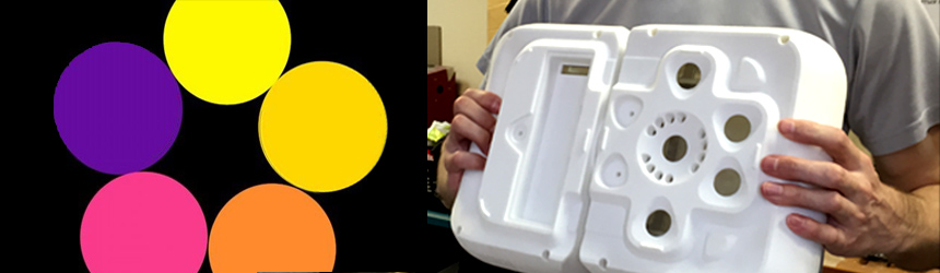
A few weeks ago, at 5:30am on a gloomy Tuesday morning, I receive a text message from the Director of our Manufacturing division. It read: “I like purple with orange”. The message was followed by a JPEG of a strange color pallet (yellow, orange, pink and purple circles next to each other on a black background).
The color combination was a bit unorthodox and the text might have seemed strange, but I knew exactly why I received this message. I groaned and got out of bed. As I robbed my temples, I wished I had set the phone to vibrate before going to sleep.
In my previous article, about naming our new 3D scanner, I forecasted that the debate about the color of the casing is still ahead. What color should our new device be? To say that I got “feedback”, would be an understatement.
In our company, we try to avoid hierarchies. There is no mean boss, there are no opportunistic middle-managers, and no forgotten, underappreciated working class. We try to make decisions together and every voice that wants to be heard, is heard. I suppose this will change once we grow past 100 employees, but for now, this approach works well. The drawback to this methodology is that certain decisions take longer than I would like. And when it comes to color combinations, apparently, almost everyone has an opinion.
So what color should our new scanner be? One color? A combination of two colors? Mainly one color with small accents of another or even a third? Should the colors be bright? Or plain? Dark or light? Should we keep our corporate colors (bright orange and gray)? Or are they too aggressive? How would each color look on the type of plastic we use for our devices? Would a particular color make the device seem more expensive or like a cheap, plastic toy? My inbox and our internal forum is flooded with suggestions. I get stopped in hallways and receive late-night text messages. I’m grateful that my colleagues have such a vested interested in product development, but this flurry of suggestions only makes the final decision harder.
Our new 3D scanner, “Drake”, is made up of two parts: the “head” (cameras and projectors) and the “body” (built-in CPU, touchscreen, battery). Each of these parts is comprised of two halves (the front and the back). There are a few other plastic parts, but the foremost debate was over these four pieces (two in the back and two in the front). At some point the discussion got so heated that a programmer with Photoshop skills volunteered to illustrate different suggestions. The poor man was at his computer for 6 hours with his colleagues behind him screaming “Now try blue and black … nooooo … now try brown and beige … nooooo”.
So here is a recap of the turmoil that took place over the past two weeks.
Blue and gray
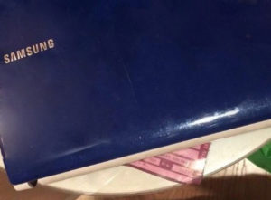
It started when I received my first, late-night text message from the admin department. Apparently they liked their blue Samsung laptops. I wasn’t opposed to the idea, but when we met in the office the following morning, the ladies told me that they actually don’t like the dark, navy color they suggested and that they went to a bar after work and the idea seemed good at the time.
Dark beige and dark brown

The Finance Director, who, at some point in her life, went to art school, was adamant that we needed to keep things simple and plain. She thought that we shouldn’t make the colors too bright. The rest of the staff felt the scanner now looked like a big chocolate bar … bitter dark chocolate! She was voted down.
Light beige and light brown

She persisted and argued in favor of the same colors, but lighter. The rest of the staff, once again, saw a chocolate bar … now it was milk chocolate. No! (but everyone thought it was time for lunch)
Black and purple

Someone suggested that we should use the royal, purple color, as it is very dignified. We tried several hues of purple, but nothing looked good.
Orange

Let’s just keep our corporate color: orange. Oh, no. That doesn’t look right.
Yellow

How about yellow or dark yellow? That’s not good either.
Red and brown
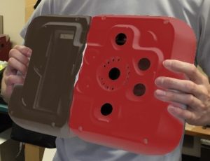
We all like red, how about we mix it in with brown? This makes the device look bigger than it is. Too “heavy”.
Black and white

Are we overthinking it? Should we keep it white? Or black and white? May be that’s too simple?
Black and aqua

Ok, let’s keep the black, but add a splash of color like aqua?
This went on for days. We would come to a decision and then, 12 hours later, someone seemed adamant that we were making the wrong decision. One staff member went to the library (yes, the neighborhood library) and brought back a book called “The language of color: how to use the advantages of your color for personal and business success”. It only confused the discussion further.

So what did we finally settle on? Click here to find out. I don’t know if it was the right choice. Frankly, I’m exhausted. But this fervor and dedication of my colleagues is inspiring. I’m so impressed and motivated, that I can easily forgive the 5am text messages.
Anna Zevelyov
Thor3D
Director of Sales